

Church Announcement Slides People Actually Watch
Most church announcement slides get ignored because they’re trying to say too much at once. Here’s how to design a pre-service slide loop your congregation will actually read.

Why Accessible Design Matters for Your Church Graphics
Accessible design isn’t a specialty skill reserved for government websites. Here’s how contrast, font choices, and a few simple habits make your church’s graphics work for everyone in the room.

How to Design a Church Bulletin People Will Actually Read
A cluttered bulletin gets skimmed and set down. Here’s how to decide what belongs on the page, build a layout people can scan in seconds, and keep it consistent week to week.


How to Build a Church Brand Guide Your Team Will Use
A church brand guide is the one document that keeps your sermon graphics, social posts, and website looking like they belong to the same church. Here’s how to build one without hiring an agency.

Build a Church Social Media Graphics System That Lasts
Most churches don’t have a social media design problem, they have a system problem. Here’s how to build a brand kit, template library, and posting rhythm your team can actually keep up with.

Church Website Design: What Turns Visitors Into Guests
Most first-time guests visit your website before they ever visit your church. Here’s what your site needs to turn a curious click into an actual visit.

Why Nobody’s Opening Your Church’s Email Newsletter
Most church newsletters lose readers because of layout, not subject lines. Here’s what an email people actually open and read looks like.

Your Kids Ministry Needs Its Own Look, Not a Smaller Version of Yours
Most kids ministries just reuse a shrunk-down version of the main church brand. Here’s why giving that space its own visual identity, tied back to your church but built for kids, matters more than it seems.

How Multi-Campus Churches Keep Their Design Consistent
Growing to a second campus is exciting, but it’s also when a lot of churches quietly lose control of their visuals. Here’s why the drift happens and what actually fixes it.

Your Livestream Graphics Deserve the Same Care as Your Stage
Churches plan their stage for weeks, then let the livestream run on a leftover template. Here’s why the graphics your online viewers see matter just as much.

How to Design a Volunteer Recruitment Push People Actually Answer
Most volunteer recruitment graphics blend together because the ask is too vague. Here’s how to design a campaign specific enough that people actually respond.

Why September Is the Best Time to Plan Your Church’s Christmas Design
Christmas is your church’s biggest outreach moment of the year, but most churches wait until November to start designing for it. Here’s why September planning makes the difference between rushed graphics and a season that actually looks intentional.

The Design Mistake That’s Costing Your Church Volunteers
A generic “volunteer here” slide rarely gets anyone to sign up. Here’s why specific, repeated asks with real photos work better, and how to build them without more work for your design team.
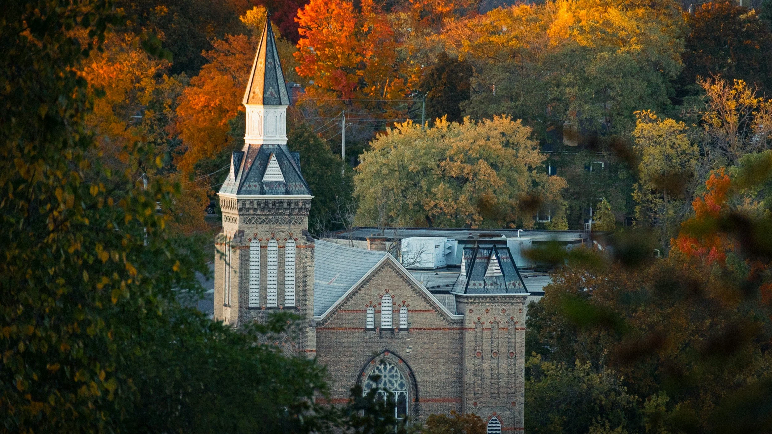
How to Design a Trunk-or-Treat Flyer That Actually Fills Your Parking Lot
Trunk-or-treat is often a church’s biggest first-touch event of the year, but the flyer for it rarely gets the same design attention as a sermon series graphic. Here’s how to fix that.
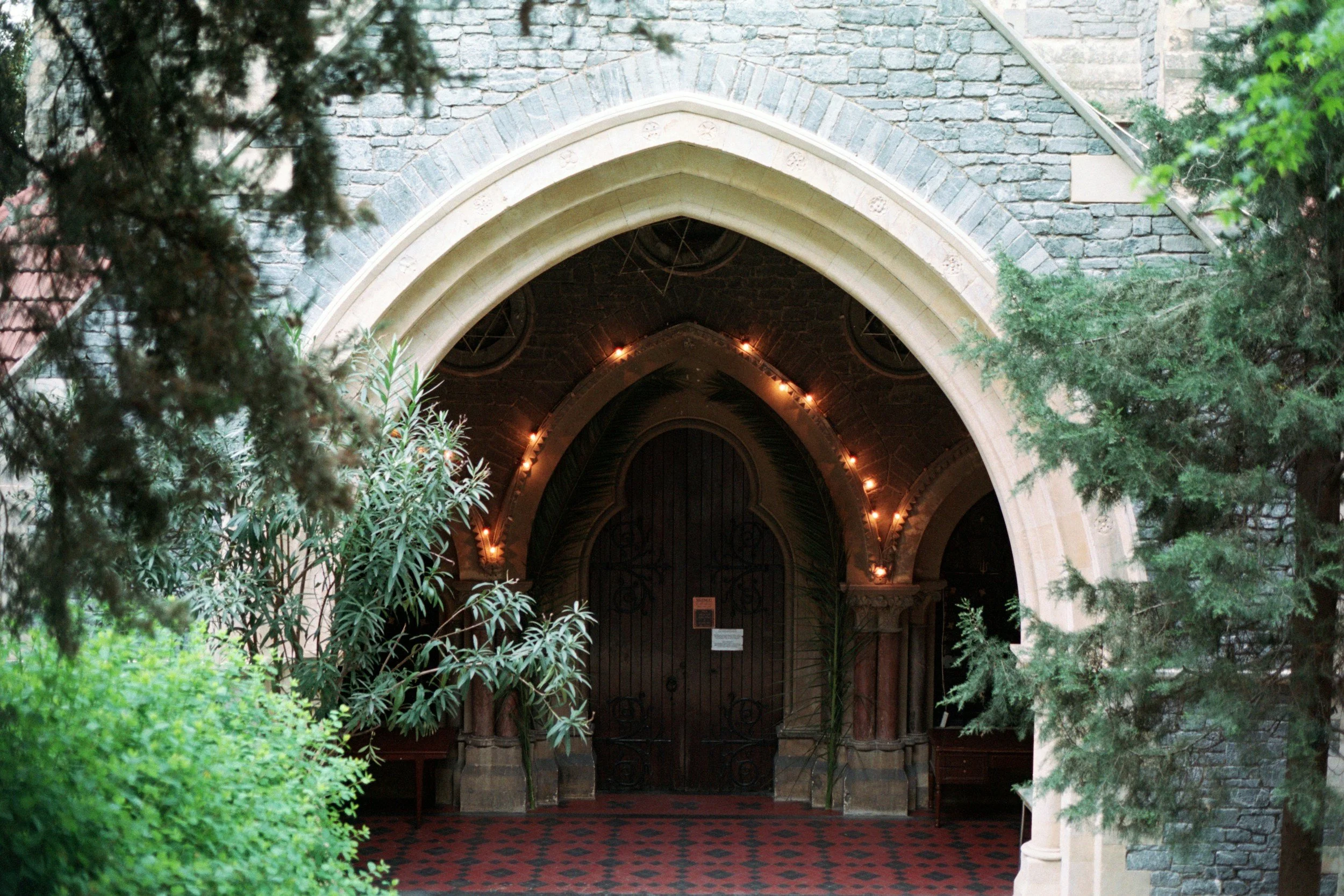
What a First-Time Guest Sees Before They Ever Walk Through Your Doors
Visitors judge your church online long before they walk through the door. Here’s how to make sure your website, social media, and print materials say what you actually want them to.
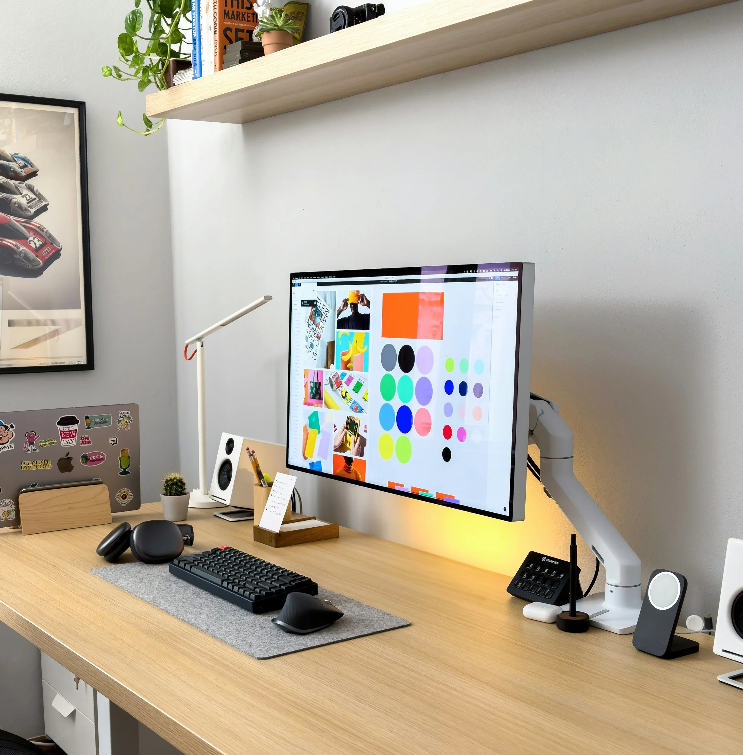
What Actually Makes a Church Logo Work
A church logo doesn’t need to explain your theology. It needs to survive a tiny social media avatar, a black-and-white print job, and being drawn from memory. Here’s what to check before your next redesign.

Why Your Church’s Giving Page Deserves Better Design
Most churches polish their homepage and forget the giving page entirely. Here’s why that page deserves just as much design attention, and what good giving-page design actually looks like.
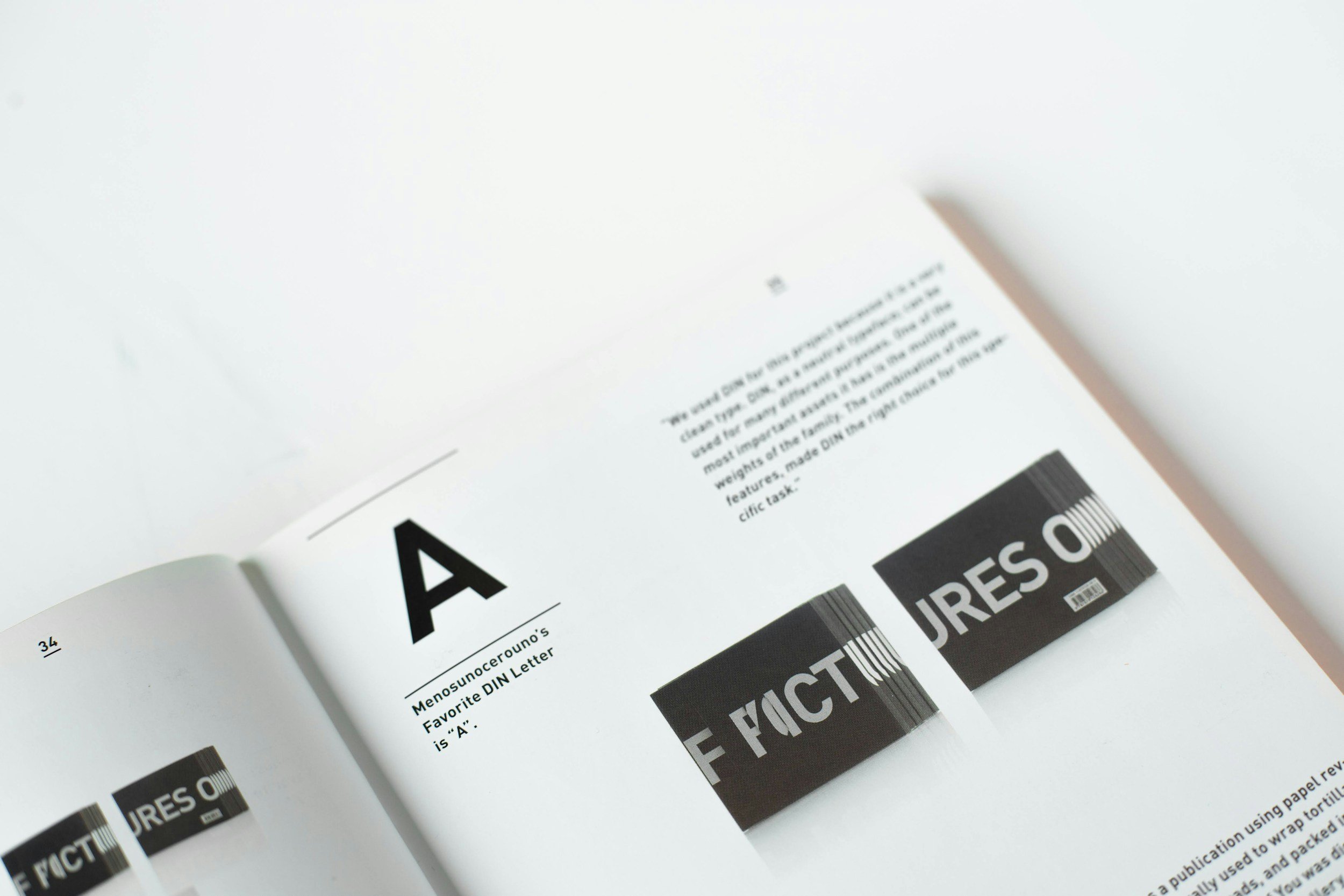
Your Church’s Font Choices Are Saying Something. Are You Sure What?
Most churches know their brand colors but have never actually chosen their fonts. Here’s why that gap matters, and how to fix it with just two fonts and one simple rule.